
Computer Artwork
Various artworks I've made digitally over the years through different programs.
Fake Criterion Collection Coverart
I'm a huge fan of the Criterion Collection film collection. Being a fan and collector, I have my own list of films I personally believe should be in the collection. I ended up teaching myself Adobe Photoshop by creating my own fake Criterion Collection cover art for some of the films I'd like to see in the collection. The further you go down, the older the cover art is and you can see the progression I've made.
(And yes, I've submitted my suggestions to The Criterion Collection and so far none of these have been added... oh well!)
(And yes, I've submitted my suggestions to The Criterion Collection and so far none of these have been added... oh well!)


|
Wristcutters: A Love Story
2006, Goran Dukic -One of my favorite indie films and a different take on the idea of the "afterlife". The cinematography is a perfect staleness that matches the tone, the comedy is odd and quirky and the acting is phenomenal. Plus, I'll see anything with an obscure and just overall weird Tom Waits. Children of Men
2006, Alfonso Cuaron -A fantastic film by the great Alfonso Cuaron and considered by many to be one the best (if not the best) film of the 2000's. The acting is pitch perfect, the story is a new variation of a classic scenario and features one of the most horrifying, yet possible, apocalyptic futures. Not to mention it probably has one of the best long-take tracking shots in film history. Trainspotting
1996, Danny Boyle -An indie film cult classic from acclaimed director Danny Boyle. I'm actually shocked that this film in particular hasn't been added to the collection but given that they have recently added Boyle's prior film Shallow Grave, I think that it may be just a matter of time before this film gets what it deserves. 12 Monkeys
1995, Terry Gilliam -By far my personal favorite cover art. This film is obscure, thrilling, creative and one of Terry Gilliam's best. Not to praise my own artistry, I think the image represents the film very well. From the mid-fall break in the chain to the iconic Barrel of Monkeys being the representation (Notice; there are twelve of them). I really hate talking up my own work but when I'm this proud of something, I need to say it. Adaptation.
2002, Spike Jonze -First off, yeah, I realized that I misspelled Spike Jonze name on the cover art. Anyway, this is a fantastic and one of the weirdest and oddly creative conceived films I have ever seen--which is expected from Jonze and the "Kaufman brothers". Plus, it's nice to see Nick Cage in a good film Brick
2005, Rian Johnson -The first film of Rian Johnson, who has gained recognition from The Brothers Bloom and the creative Sci-Fi Looper, and is also going to be the director of Star Wars VIII. What I love so much about this film is the depiction of American youth being put in adult situations; being something that I love writing myself. I love that I was about to find this brick-texture and the crude painted lettering because aside from being sort of an in-joke, I think it represents the film's tone. Submarine
2010, Richard Ayoade -A great little indie flick from the UK focusing on young love (another motif I adore), but this takes a quirky surrealistic turn that is still rather believable. I think it's a hard feat to have child actors as the main characters seem realistic but this film does in incredibly well. You believe these are real kids, you believe they are in love and dealing with difficult coming-of-age issues, which is hard to make without being cliche. The Warriors
1979, Walter Hill -Another cult classic with a thrilling set-up, a creative world, gritty action sequences, and not to mention a soundtrack that just kicks ass. This is one of the simplest of designs I've done, in fact, aside from the Criterion display format, all I added was some of the lettering. But to be honest, I think that's all it needs. This image, the vest, the name are all iconic and this picture of the Warriors vest is all I think is needed. I really did make this cover art just to show that I think this film deserves to be a part of the collection. Apocalypse Now
1979, Francis Ford Coppola -I think if it's good enough for the Cannes Palme d'Or in 1979, it should be worthy of the Criterion Collection. It's iconic, influential, brutal, and some consider it one of the most important films about one of the most tragic wars in American history. I took this iconic image from the film and re-imaged the look. I wanted it to look grittier but keep the flowing artistic value that the film has. Pink Floyd's The Wall
1982, Alan Parker -A classic, surreal, representation of one of Pink Floyd's best albums which happens to be one of my favorites. Going back to the simplistic display of the cover art with the only addition being the Criterion display changed into the classic "Floydian" lettering. This is primarily because the cover art is so iconic and I made this decision because I have an original LP printing of the album. The original record only has the iconic brick pattern. No "Pink Floyd", no "The Wall", it's just the bricks and I think that is all is needed. Not to take away any credit from Roger Waters, Pink Floyd, or Alan Parker. Mary and Max
2009, Adam Elliot -This is one of the best made children's films I've ever seen. It's atmospheric, it's emotional, it's complex, it's unbelievably human and it's a film that treats its viewers as adults. The beloved relationship between a broken middle-aged man and this young outcasted girl who never even meet but have an intimate friendship that is only carried through letters. Underrated and at some times almost too heartbreaking but by the end, you can't help but smile as you connect with the Mary character. Which is what I wanted to show in this cover art. Midnight in Paris
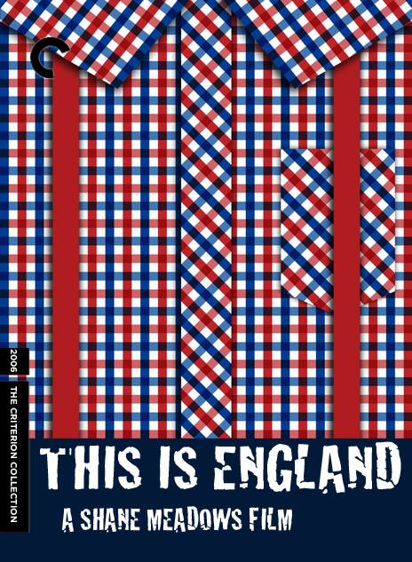
2011, Woody Allen -By far my favorite Woody Allen film on a creative level and a personal level; the exploration of my favorite artistic era in world history being the 1920's. I took a well known painting and added the few elements onto it showing what the film is and honestly I think that's perfect because the film itself is basically takes classic artwork and atmosphere and places the characters inside. I've personally felt that most of Woody Allen's films have been overall overrated, but I personally love his Euro-trilogy with Vicky Christina Barcelona, Midnight in Paris, and To Rome with Love. This is England
2006, Shane Meadows -An underrated film that genuinely captures a cultural touchstone in history: The English punk scene in the early 1980's. That's why i chose the cover art to be primarily the wardrobe the characters wear because it embodies what was culturally relevant to their identity. Broken Flowers
2005, Jim Jarmusch -One of my personally favorite films and from one of my favorite directors. I took a simpler tone again but gave it the classic pink pop that the film is none for. Bill Murray is at his best and the road trip is as fun as it is heartbreaking. Elephant
2003, Gus Van Sant -A breathtaking and daring film. I thought the classic optical illusion image would be rather fitting. 12 And Holding
2005, Michael Cuesta -One of my first pictures (obviously), but the birthmark on the face really makes a statement and a character itself in the film. The Cabin in the Woods
2012, Drew Goddard -This is one of the best horror films and satires in recent years. Freaks and Geeks
1999, Paul Fieg -The classic and cult classic TV show that was canceled far too soon. What is so great about this is that the young actors all went on do have big and successful careers of their own. This started it all and every minute was worth it. End of Watch
2012, David Ayer -Probably one of the newest films I chose, but I love that much of it was filmed as if through dashcams, computer cameras, security cameras... kind of like an episode of Cops... except better. Which is why I chose a film-grain. I think it's fitting. Microcosmos
1996, Claude Nuridsany and Marie Perennou -One of my first, obviously, but I think this represents the film well. It's not even a documentary, it's just a dialogue-free representation of bugs living their lives; the beautiful and the terrifying. Snow Angels
2007, David Gordon Green -My first and very much least favorite cover-art image. Despite the sloppiness of the photo imaging, I am a fan of the blood splatter that goes beyond the picture of the snow angel itself. |
